


Fajar, the CTO of HappyFresh, contacted me to say that he started a new company called HappyFresh, and they are building the product.
And that the company needs a logo. I was asked to design the first logo of HappyFresh.
And then, Fajar introduced me to Sasha; at that time, she was the Product person for HappyFresh.
The process
From there, I started to sketch a couple of ideas and propose the ideas to the team.
I worked directly with Sasha to bounce ideas for the symbol.
There are two things that they need:
The symbol
The logotype


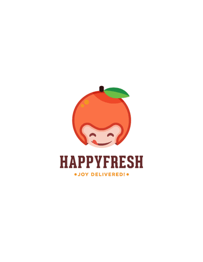


The team decided to pick the one with the helmet but then requested to change it to an orange.
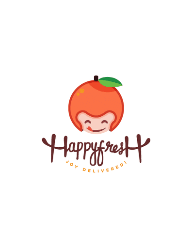
And then, I started to play around with the logotype.
I sent a couple of options to them and then started working on another iteration from there.


Almost there
We decided to go with the red color and then add the cartoonish style to the symbol. And then, I started working on the color palette.
At this time, I was finalizing the logotype. I decided to go with the freehand type of font.
I took Gotham as a base style and added some HappyFresh touch to the font.
"I still trying to play around with the different style."


